Photography | Technology | Yoga | yogaFLIGHT
Rebranding of a Canadian Icon


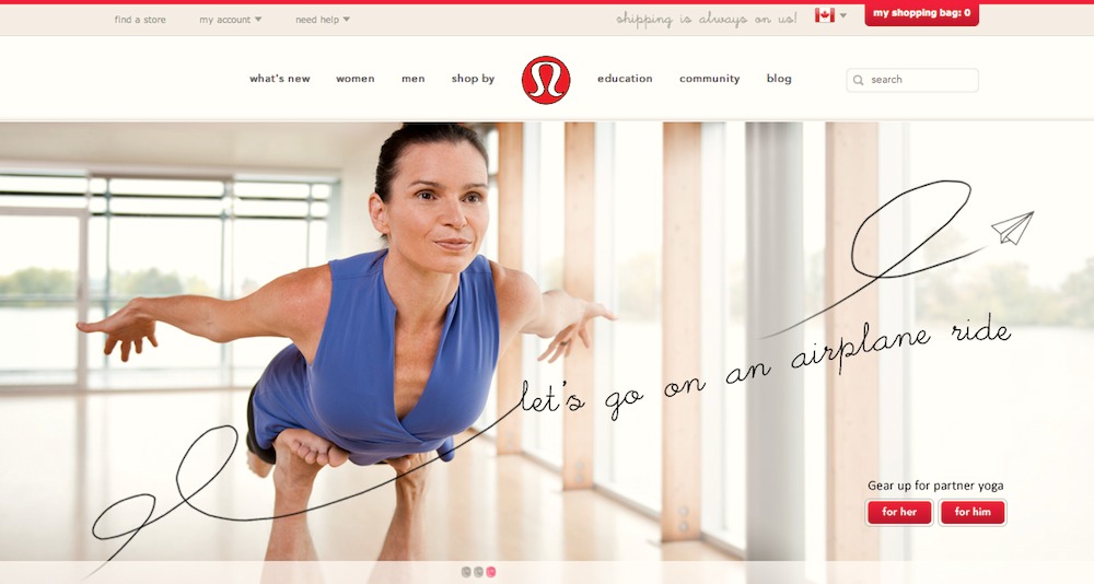
Lululemon launched a whole new design with the rebranding of their website. White vs black. More sleek and vavaVoom, with meaningful bells and whistles that enhance the user experience.
We received an email from the marketing firm who worked on our story for the feature, telling us about the new photo of us online — the photo on the left. WOW! This company continues to surprise us with new poses from our photo shoot, here and there where I least expect, such as on their twitter and facebook pages. What lovely surprises to stumble upon!
